For the third time in history, Intel changed its logo. Intel rebranding made the brand grow again. Intel is an international manufacturer of computer processors and one of the pioneers of the new era of computing. Intel’s headquarters are in Santa Clara, California, Silicon Valley. The company is currently the second largest processor manufacturer in the world and the second most valuable company in the industry.
Currently, Samsung has stolen the first place from America. Intel is known as the creator of x86 processors in the world; The processor is used in most personal computers today. Apple, Lenovo, HP, and Dell are among the big companies that are Intel’s primary customers. This company actively produces other computer parts, from external memory to network equipment.
The current status of the Intel rebranding
Intel is currently the second largest processor manufacturer and the second most valuable brand in the industry. According to the latest published report, the company’s revenue in 2017 was about 62 billion dollars, and its net profit was about 18 billion dollars. The company currently has about 106,000 employees, and large companies such as Mobileye, McAfee, Here, and Wind River Systems operate as its subsidiaries.
Graphic design gives images value and meaning.” Paul Rand
What graphic design can do for brands is perhaps to give meaning to the mental image of the brand, and perhaps in the new Intel logo, this is done by emphasizing the letter “i”.
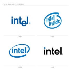
Intel has changed its logo for the third time in history.
The business manager of the company “Karen Walker” explained the most important reason for this change, looking to the future; The box around the logo has been removed, as it seems to be enclosed in a box and is reminiscent of the old 20s logo.
To fully highlight this rebranding, Intel was one of the main sponsors of the 2020 Olympics, which of course were not held due to the spread of Corona.
Each image or brand name probably has an element to discover and represent, such as the letter (i) in the Intel brand.
This brand redesign team paid special attention in 2006.
Crossing the lines around the brand and ending with this term is an attempt to make the audience understand the term and its relationship with the brand’s slogan of ‘Future Supporter’.
The original Intel logo was designed in 1968.
The company’s logo was first changed in 2006, almost 40 years later, but in 2020, almost 14 years later, the brand underwent its next redesign.
The first message of these changes is to shorten the years of keeping the logo and visual identity of the brand constant.
In recent years, we have seen updated models of various brands, which is directly related to the pace of life of the audience compared to previous years.
The faster the external changes for the brand’s audience, the earlier changes are felt in brands because the audience’s tastes are always changing and updating.
For technology brands, these brand design changes must be made in a short period due to rapid changes in the business environment to show the audience a sense of innovation, something important and central to such goods and services.
If our customers think that this brand is constantly updated, then they will think of its products in the same way.
The feeling that Intel’s CPU will be 80 times more efficient in five years should be clear with the changes in its external elements.
As can be seen in these images, high-purity colors and modern designs follow this concept.
Color and images are what we use to convey abstract concepts like freshness and quality.
For secondary colors, shades of orange, black, and yellow should be used in advertising and marketing the company.
What is interesting here is that the color palette of the brand allows you to place colors anywhere in the world.
In Japan, for example, marketing departments can use a lot of red, which is considered an important color in that country.
This option will make it a little challenging to keep the main colors of the brand in the mind of the audience, but since this brand is in eleventh place in the list of the best brands of 2020, it can be considered to be an entire group in the mind of the audience. It is created by its color and visual identity, and with this mentality in the use of secondary colors, color customization in different areas can look beautiful.
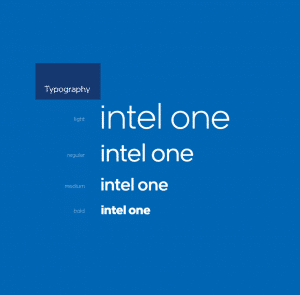
It is designed and developed for the Intel One font, which has a completely harmonious structure with the logo in four weights.
Font with the same letter thickness and by the new format of the brand logo.
This time, after the slogan “Supporters of tomorrow“, Intel with the slogan “Build something amazing” wants to show that among tough competitors such as Dell, Acer, HP, and Samsung, we still have to wait for something amazing. This brand.
In this article, we talked about Intel rebranding, but we think that we can still use your experience to produce a better and more comprehensive article.
Share your experiences with us.
Share your experiences with us.
Some genuinely prize content on this site, bookmarked.
I am happy and honored that you like the website articles. Please share your comments about other articles with us.
If you are interested, we can publish your articles on the website in the specialized areas of the website
Wonderful work! This is the type of information that should be shared around the web. Shame on Google for not positioning this post higher! Come on over and visit my website . Thanks